Cases

UI / UX audit of a promo site

We conducted a usability audit of the site of a well-known motorcycle brand. Since many of the errors found in it are fairly typical, we want to discuss them separately. And also offer successful solutions.

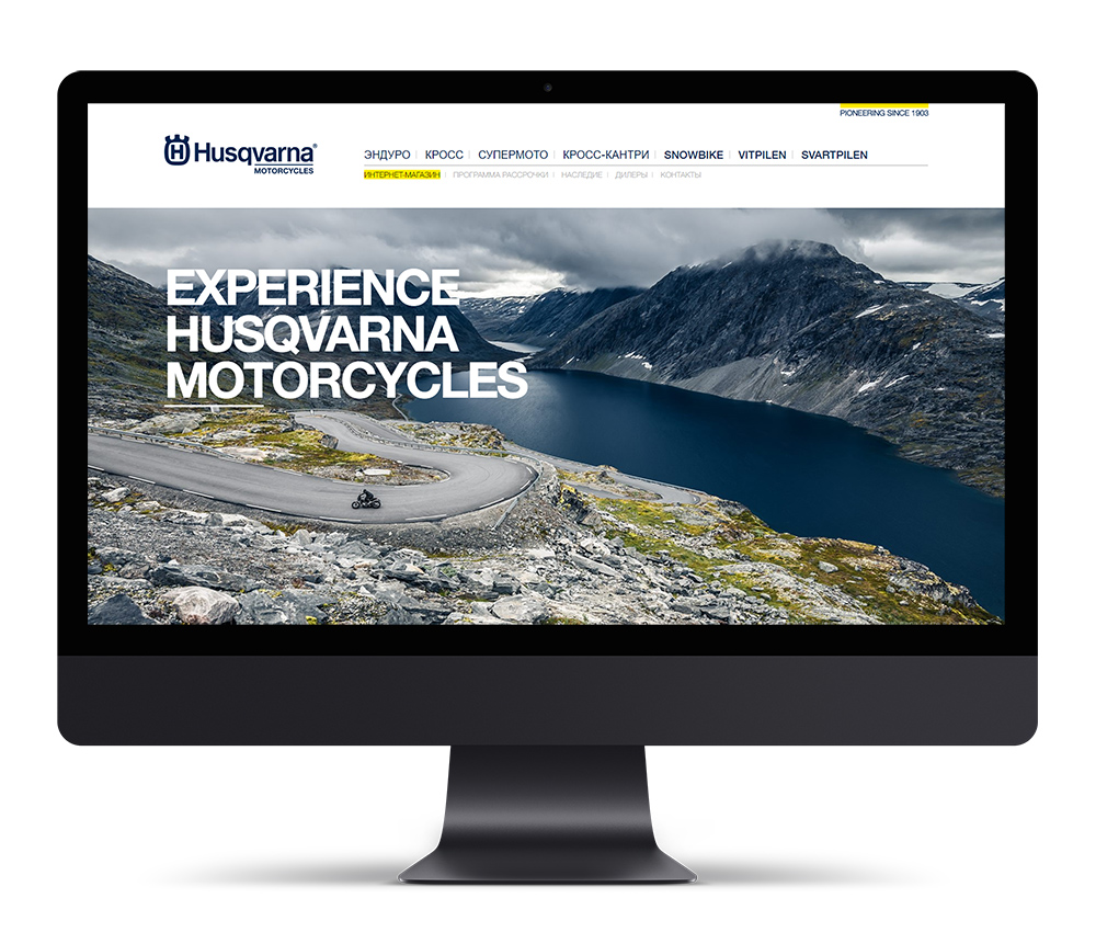
W We conducted a usability audit of the site of a well-known motorcycle brand, since many of the errors found in it are quite typical, we want to analyze them, as well as offer successful solutions.

The site's style is defined by the brand book, which shares many stylistic elements with BMW Motorrad ( in 2007, BMW bought out Husqvarna Motorcycles from MV Agusta Motor S. p. A.).

We took into account that this is a local version of the global resource that does not allow global deviations.

We conducted our audit based on three main principles
  • Custom script
  • Prototypicality principles — prototypicality is the degree to which an element is representative of a given category, i.e. it can serve as its model. In other words, an action that occurs with the same objects must be predictable and lead to the expected result, and objects that have a similar action must have the same design)
  • Comfort of user's perception of information
UI / UX audit of a promo site
A link to another resource of the company

The menu contains the button "online store". The button is highlighted in yellow, which is an element of the corporate identity, and is used to emphasize attention. In this case, the error is as follows:

  • The user sees the highlighted button as an indication of the current section.
  • The menu item leads to another resource that opens in a new window, although all other menu items lead to the pages of this site, which causes the user to switch and abort their script.
Variant of solution

In order not to deviate from the style, you can use the area that is occupied on the global site by searching for and selecting regional resources. In any case, you should put the button in a separate independent block. The design can be done with a block similar to” pioneering since 1903", a contour button, or a banner button. It is desirable that the blocks on both sites overlap visually.

Errors in navigating the model catalog

Despite the fairly small catalog, navigation is not transparent for the user. The catalog structure is quite traditional: Series, Category, Model. Here are the main errors in directory navigation:

  • In the catalog sections, including model cards, there is no indication of the location of the page in the catalog structure, and therefore the transition to other models in this series is possible only through the menu. The main traffic comes from search engines and does not lead to the main page.
  • The catalog does not have a filter or other tool for selecting a motorcycle by parameters.
  • Menu items are written in different languages, English names have a different font thickness, which implies differences between the contents of these sections, but in fact they are not.
  • When switching from the menu to the series, the user is faced with 3 different types of information about the series and models in it.
Variant of solution

The problem with the lack of display can be solved in several ways: bread crumbs, output the series name from the model name with a link. Other models in the series can be displayed in a separate section at the bottom of the page.

The reasons why categories have different views are clear, and it is acceptable in cases where the audience of products practically does not overlap. But for a user who wants to explore the range, this decision will lead to confusion. If landing pages are needed, it is better to implement them " parallel” to traditional catalog pages.

Categories

You can only go to the product profile by clicking on the “View” button (in English, View bike). There are two significant drawbacks: a small area for clicking-there is no link from the photo (although there is one in the English version), and the “View” button implies increasing the image much more than going to the product page. This way the product page remains inaccessible.

Variant of solution

Replace the button name with the more familiar “more", and make a link from the entire block with information about the model.

Product card

There are many non-critical errors in the product profile, but together they lead to higher bounce rates in this section. Namely:

  • Product sellers are implemented in one of the following scenarios: traditional, in which the main information is placed in the first two screens, and landing. In this case, a not very successful hybrid was used. There is no funnel on the page that the user needs to move through. The classic funnel looks like this: an offer, basic additional information, handling objections, a second block of less important information or reviews, related products (so that the user does not leave the resource). However, at almost every level, the user needs to be able to go to the target action.
  • As already written above, there is a great lack of indication of the section where this model is located and transitions to other models in this series.
  • The price is output in a single line of 7 characters, which makes it difficult to read.
  • The card contains four buttons: "pre-Order”," Buy in installments”, "Find a dealer“, and the”Features and benefits" section. They are designed in three styles-yellow, yellow with a contour and transparent with a blue contour. The first ones are links to other pages, and the last ones are content switches. The first three are action buttons, which essentially lead to a single target action - an order, but they are designed the same as the “view” button on the previous level. The “pre-Order " button is not significantly highlighted. on page. At the same time, the main page uses 3 completely different types of buttons that function as links.
  • Social network buttons are sharing that has a design in the form of links to a group in the social network. When sharing, information about the page is not picked up due to the absence of OpanGraph tags, which reduces this functionality to almost nothing.
  • The left block of the first screen is heavily overloaded due to the accumulation of so many elements.
  • The white text on the photo makes it difficult to read.
  • When you initially switch bookmarks in the "Features and benefits" blocks, the blocks run over each other.
  • Technical characteristics are served on a yellow background. Yellow in all other sections is used as an accent, but here the accent is not needed, and only makes it difficult to read.
Variant of solution

Give the product pages a unified structure, placing the information according to priority.

Reduce the number of buttons: submit installments as reference information, search for a dealer as a link - they can just fill in the empty right corner, and make the main target actions "Order". "Pre-order" says more about what has not yet been put into production.

To preserve the style of a photo with text on top, you can shadow it when you hover, which will increase the contrast and readability of the text. Since. it is better to do the opposite-leave only the title on such a bright yellow, and place the characteristics themselves on a calmer shade.

Order registration
  • Product sellers are implemented in one of the following scenarios: traditional, in which the main information is placed in the first two screens, and landing. In this case, a not very successful hybrid was used. There is no funnel on the page that the user needs to move through. The classic funnel looks like this: an offer, basic additional information, handling objections, a second block of less important information or reviews, related products (so that the user does not leave the resource). However, at almost every level, the user needs to be able to go to the target action.
  • The pre-order page is a landing page in ad campaigns for models, and the user is not provided with information about the model - the user has to specify the model themselves. The same scenario is offered to users when they click through from the product profile page.
  • The delivery period is not specified, but a contract is offered with a 50% prepayment. The cost currency is not indicated.
  • A single field under the full name indicates that there is no automated order processing system.
  • Suggestions in the input fields are not contrasting to the point of unreadability.
  • The phone number input field has a hint but is not formatted, which allows for input errors.
  • Information about the required scans of passport pages is located in the upper section of the text.
  • The action buttons look the same.
  • Information about the installment program is located on a separate page, and its essence and advantages are spread across different screens.
  • The installment page specifies the region, but does not request documents that are necessary for pre-ordering.
  • When making an error when filling out the form, the field where the error was made is highlighted, but it does not indicate what it is about - or an example of filling in. The illumination is duplicated below (almost out of sight) by the inscription "Fill in all fields correctly".
Variant of solution

We recommend combining the forms into one. In General, we have brought the user to the last step of the funnel, and the main thing is not to frighten them with opaque conditions and a request for a large amount of information. The model must be inserted automatically, so the cost and delivery time will be immediately visible on the page. Delivery time should be displayed, without knowing it, the user does not have enough information for decision-making. It is better to describe the procedure for reviewing an application for an installment plan and the process of signing the contract separately, accompanied by a visual diagram. It also allows the user to control the stage of their request (including order completion). This information can be transferred to your personal account.

It is desirable to include the installment program option in the form of a checkbox, and when you select it, display data on the first payment and monthly payments. You must also specify where and how the motorcycle will be received, and whether receiving it in the region without representation will incur additional costs.

It is better to request passport data in the form of separate input fields, and make applying scans optional. This will simplify the processing of applications in the future. The user will be reluctant to do a scan for a number of reasons - this is both a concern for the data, and unnecessary actions ( it is better to replace the scan with a “scan or snapshot”).

These simple changes will increase the conversion rate by an order of magnitude. Literally. 10 times!

Mobile version of the site. Adaptivity

The mobile version also found some minor but annoying errors:

  • In some sections, there are no minimum fields and the navigation element is pressed to the very edge.
  • The first screen of the main page on the most common resolution 320px was completely empty. On it, the motorcycle is almost invisible.
  • Font sizes are not adapted for mobile devices - in some cases the font is too large, and in some cases it is too small. This makes it very difficult to read information. In General, the Cyrillic version of the font has a lot of questions on the desktop version, but on mobile devices, all its shortcomings are more obvious. This means that the spacing between letters is too small (kerning), the strokes are too thin, some letters are out of proportion, and the Cyrillic and Latin letters are not combined in the same block. All this is a consequence of the use of a font in the web, developed primarily for printing.
  • Navigation elements are smaller than the allowed area of 32*32 pixels, which makes navigation difficult, especially considering the main audience - men, for whom it is better to make elements at least 40*40 pixels.
  • Access to the menu is hidden when scrolling down, so to go to another section of the catalog, the user must scroll the entire page back.
  • Table data is not adapted, as a result, part of the data is truncated by the visible block.
How do I approach fixing usability errors?

It is better to make a decision on whether or not to make certain changes based on efficiency. in Other words, if the cost of making the change will pay off within a year, it is better to make it. You can estimate the cost of making an adjustment by contacting a technical specialist, and an expert can estimate the forecast of the effectiveness of such a change based on their experience or research, such as A/B testing.

Our recent works
New stunning projects for our amazing clients